Edgefolio Ui & UX uplift.
UI and UX uplift, aligned with a new rebrand to enhance key features and improve overall usability and navigation.
-
Fundplatform delivers enterprise capital introductions software. It is one of the products offered at Edgefolio.
One of these solutions is Fundportal, a product which delivers enterprise capital introductions software to global investment banks.
-
The previous Fundportal platform was made by the dev team over 8 years ago with no design input.
Therefore the goal of this project was to recreate and update the platforms UI style and Design patterns while looking specifically at the Contacts area of the platform.
The aim is to roll out the new visual style and design patterns across the wider platform, so it was important to make sure we were designing with the future in mind.
-
Research, sketches & wireframes, Ui refresh, UX.
Project Breakdown
The decision to remake Fundplatform stemmed from the need to strengthen the connection between design and development. Our goal was to streamline the process for everyone involved.
By recreating the platform, we established a solid foundation that allows us to experiment with new UI elements and ensures consistent design handovers to developers in the future.
Additionally, we collaborated with a branding agency for a comprehensive rebrand, seamlessly integrating their work into our redesign efforts. This collaboration ensured a cohesive visual identity and enhanced the overall user experience.
1.
Remake of Fundportal
2.
Introducing a new Ui
3.
Brand development
The Problem & Solution
An update was needed to enhance the user experience and keep pace with evolving design trends. A refreshed interface improved navigation, streamlined functionalities, and ensured a modern, user-friendly environment, ultimately optimizing the platform's usability.
Revamping Edgefolio's FundPlatform UI involves prioritising key features like Contacts, Fund Details, and the Dashboard. By enhancing the design and functionality of these specific components, the update aims to create a more intuitive and efficient user experience, ensuring seamless navigation and improved usability within these critical areas of the platform.
Edgefolio's FundPortal boasts a diverse and growing user base, comprising investment professionals, fund managers, and institutional investors. The platform serves as a dynamic hub where these users can efficiently manage, analyse, and monitor various investment funds, fostering collaboration and informed decision-making within the financial landscape
Design Process
1.
Discover
Surveys
Usability tests
Data analysis
User observation
2.
Synthesis
Site mapping
Empathy maps
Personas
Journey maps
3.
Ideate
User flows
Card sorting
Wireframes
Lo-fi prototype
4.
Design
High-fi designs
Component library
Branding ideation
Developer handover


Discovery
To gain deeper insights into its UI and UX, I engaged in productive discussions with the product Manager and dev teams, dissecting the interface , looking at user journeys, and overall design philosophy. This collaborative effort allowed me to not only grasp the fundamentals of the platform quickly but also to appreciate its finer details, so that I could make user-centered design improvements.
Site mapping
To grasp the size of the project, I made a site map for the current platform. I carefully mapped out all the pages, features, and parts of the platform to create a visual overview. This helped me see how everything is connected and understand the project's complexity. The site map is now a useful tool for making decisions and planning the project's future.
The User Interface
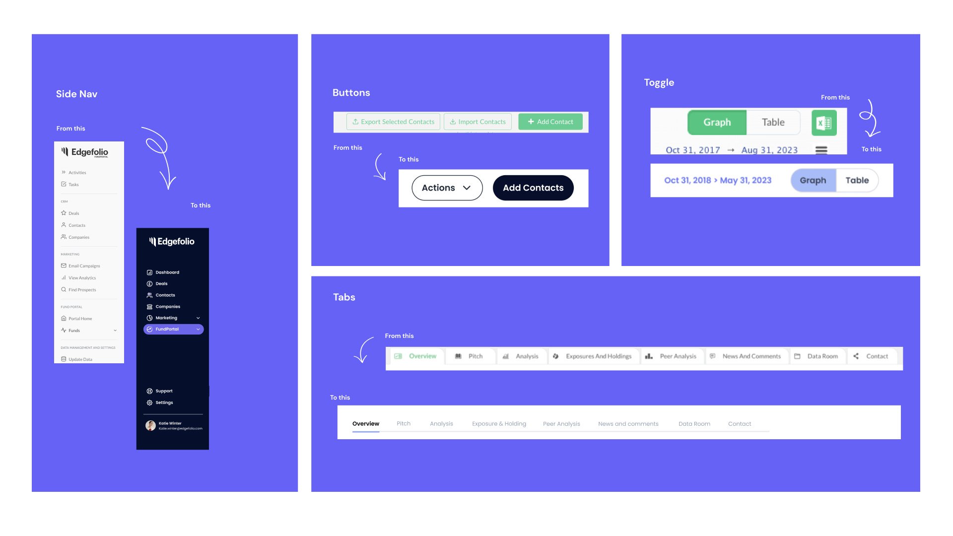
Starting with the Contacts page we looked at :
Colour Scheme: The refreshed UI features soothing, cohesive colours that enhance visual appeal, readability, and accessibility.
Simplified Actions Area: The Contacts page layout has been streamlined, reducing clutter and making actions easier to locate and execute.
Consolidated Actions Button: A single Actions button now centralises multiple functions, reducing cognitive load and improving usability.
These updates create a more intuitive, efficient, and visually cohesive Contacts page.
Choosing a component library
The primary purpose is to streamline the design and development process. Instead of creating each UI element from scratch for every project, developers and designers can use the components from the library.
We decided to go for an off the shelf component Library, meaning it was ready to use , rather than creating one from scratch.
Selecting an off-the-shelf component library offers several advantages such as consistency, efficiency, scalability, maintainability and collaboration:


Looking at accessibility
Making sure that the design followed Web content accessibility guidelines by
Designing for Visibility & Clarity, colour contrast, text alternatives and scalable typography.
Ensuring UX Writing & Consistent UI Patterns eg Clear Labels & Instructions, Error Messaging & Validation and Consistent Navigation & Patterns.
Creating Responsive & Adaptive Design, zoom up to 200%
Designing for Keyboard & Touch Navigation eg, focus Indicators – Ensure clear focus states for keyboard users, e.g. a visible outline when a button or input field is selected.
I also Used Wave to evaluated wether my designs passed the guidelines.


